Color Theory in Graphic Design: A Complete Guide for Designers
When you think about design, what comes to mind? Is it the sleek layout of a website, the vibrant cover of a magazine, or maybe the packaging of your favorite product? Chances are, the colors in those designs played a significant role in catching your attention. This is where color theory in graphic design steps in—a foundational concept that transforms good design into a memorable masterpiece.
In this blog, we’ll explore the importance of color theory, break down its core principles, and discuss how to use it effectively to make your designs shine.
What is Color Theory?
At its core, color theory in graphic design is the study of how colors interact, evoke emotions, and communicate messages. It provides designers with the tools to create harmony, contrast, and balance in their work. From websites and logos to posters and brochures, understanding color theory ensures that your designs don’t just look good they resonate with your audience.
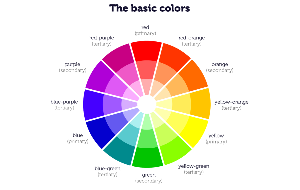
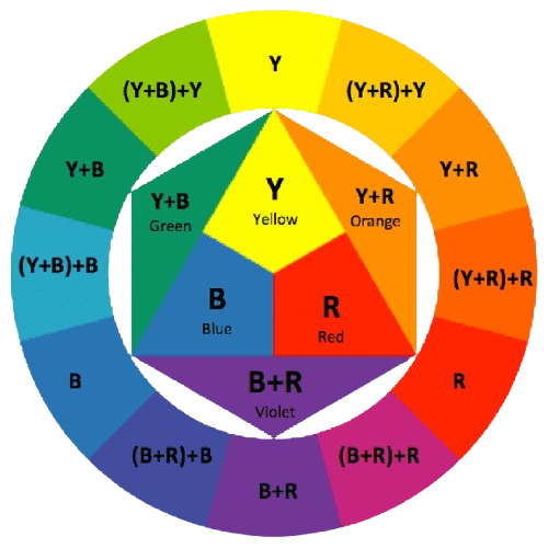
The Color Wheel: The Designer’s Palette
The color wheel is the backbone of color theory. Developed by Sir Isaac Newton in 1666, the wheel organizes colors based on their relationships. Here’s a breakdown:
1.Primary Colors: Red, blue, and yellow. These colors cannot be created by mixing others.
2.Secondary Colors: Green, orange, and purple, made by mixing primary colors.
3.Tertiary Colors: Six colors formed by mixing primary and secondary hues, such as yellow-green or blue-violet.
The color wheel helps designers visualize how colors relate and guides them in creating appealing combinations.
Color Harmonies: Finding the Perfect Match
Color harmonies are combinations of colors that look pleasing together. They’re a cheat sheet for creating balanced and eye-catching designs. Common harmonies include:
- Analogous: Colors that are next to each other on the color wheel, like blue, blue-green, and green. These create a soothing and cohesive look.
- Complementary: Opposite colors on the wheel, such as red and green. These combinations offer high contrast and energy.
- Triadic: Three evenly spaced colors on the wheel, such as red, yellow, and blue. This creates vibrant and dynamic designs.
- Monochromatic: Variations of a single color, creating a unified and elegant effect.
- Split Complementary: A base color paired with two adjacent to its complement, offering contrast while avoiding harshness.
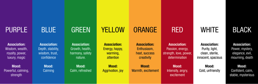
The Psychology of Colors
Colors have the power to evoke emotions, set moods, and influence behavior. Here’s how some popular colors are often interpreted:
- Red: Passion, energy, urgency (commonly used in sales and food advertisements).
- Blue: Trust, calmness, professionalism (frequently seen in corporate designs).
- Yellow: Happiness, warmth, attention (perfect for playful or youthful brands).
- Green: Nature, health, growth (used by eco-friendly or wellness brands).
- Purple: Luxury, creativity, mystery (great for premium products).
- Black: Sophistication, power, elegance (often used in high-end branding).
- White: Simplicity, purity, cleanliness (ideal for minimalist designs).
By understanding the psychology behind colors, you can align your designs with your target audience’s emotions and values.
Practical Tips for Using Color Theory in Graphic Design
1.Understand Your Brand:
Your color choices should reflect your brand’s personality and message. For instance, a tech company might use blues to convey trust and innovation, while a children’s brand might opt for bright yellows and greens to evoke playfulness.
2.Stick to a Palette:
A well-defined color palette ensures consistency across your designs. Use tools like Adobe Color or Canva’s color palette generator to experiment with harmonies.
Pay Attention to Contrast:
Contrast helps key elements stand out, whether it’s text on a background or a call-to-action button. Ensure that your designs are accessible by testing color contrasts for readability.
3.Leverage Gradients and Textures:
Flat colors are great, but gradients and textures can add depth and dimension to your work. Experiment with subtle transitions or layered patterns to make your designs more dynamic.
4.Adapt for Cultural Context:
Colors carry different meanings across cultures. For instance, white symbolizes purity in Western cultures but is associated with mourning in some Asian traditions. Research your audience to avoid misinterpretations.
- Tools to Simplify Color Choices
Modern design tools make applying color theory in graphic design easier than ever. Here are some favorites:
Adobe Color: Create and save palettes with real-time previews.
Coolors: A fast and intuitive tool for generating palettes.
Canva: Offers pre-designed palettes and color suggestions.
Color Hunt: A curated collection of trending palettes.
- Real-World Applications of Color Theory in Graphic Design
1. Website Design:
A website’s color scheme impacts user experience. For example, an e-commerce site might use vibrant colors to highlight sales, while a blog could opt for soothing tones to encourage reading.
2. Branding and Logos:
Companies like McDonald’s use red and yellow to evoke hunger and energy. Meanwhile, tech giants like Facebook and LinkedIn stick to blue for reliability and trustworthiness.
3. Marketing Materials:
Flyers, brochures, and social media graphics rely on eye-catching colors to grab attention and convey messages effectively.
4. Packaging Design:
Packaging colors can influence purchasing decisions. For example, eco-friendly brands often use earthy tones like green and brown.
- Trends in Color Theory
As design evolves, so do color trends. Some current trends include:
Muted Tones: Softer colors for a minimalist and modern look.
Neon Brights: For a bold and youthful vibe.
Pastels: Versatile and soothing, perfect for lifestyle brands.
Duotones: Pairing two contrasting colors for dramatic effects.
Staying updated on trends ensures your designs remain fresh and relevant.
- Wrapping It Up
Mastering color theory in graphic design isn’t just about making things look pretty—it’s about creating designs that communicate effectively and leave a lasting impact. Whether you’re a seasoned designer or just starting, understanding color theory is an essential step toward elevating your work.
So, the next time you choose a color palette, think beyond aesthetics. Consider the emotions, context, and harmony that make your design truly unforgettable. Happy designing!
What are your favorite ways to apply color theory? Let us know in the comments below! And if you found this guide helpful, don’t forget to share it with your fellow designers.