Color Psychology in Graphic Design: A Powerful Tool to Influence Emotions and Actions
When it comes to graphic design, one of the most powerful elements that often gets overlooked is color. Not only does it serve an aesthetic function, but color can also influence emotions, behavior, and decisions. This is where color psychology in graphic design comes into play. Understanding how different colors evoke certain feelings or perceptions can help you design with purpose and intention, ultimately driving the desired results.
In this blog, we’ll explore the significance of color psychology in graphic design, how it affects human behavior, and how you can use it to enhance your designs. Whether you’re a designer, a marketer, or simply someone interested in understanding design better, this guide will provide insights into how color can shape your message.
What is Color Psychology in Graphic Design?
Color psychology in graphic design is the study of how colors affect human emotions, thoughts, and behaviors. Colors have the ability to evoke powerful responses, making them a vital tool for designers looking to communicate specific messages or encourage particular actions.
Graphic design is more than just creating visually appealing visuals. It’s about creating a connection with the audience. Color is one of the most direct ways to achieve this connection. For example, a red button on a website might encourage users to take action, such as purchasing a product or signing up for a newsletter, because of its association with urgency and excitement.

The Impact of Color on Emotions
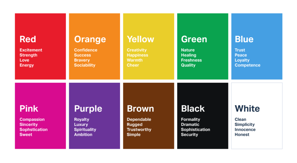
Before diving into how you can use color in your designs, it’s important to understand how colors influence emotions and perceptions. Each color can evoke specific psychological responses based on cultural, social, and even personal factors. Let’s break down the meanings of some commonly used colors in graphic design:
- Red: Energy, Passion, Urgency
Red is often associated with passion, love, and excitement, but it can also symbolize danger or urgency. It’s an intense, attention-grabbing color that can evoke strong emotions, both positive and negative. In graphic design, red is often used to encourage action or to create a sense of urgency. Think of the red “Buy Now” buttons on e-commerce sites or the bold red of fast-food logos—it’s a color that demands attention.
- Blue: Trust, Calm, Professionalism
Blue is one of the most commonly used colors in graphic design, especially for corporate branding. It’s a color that exudes calm, trust, and professionalism. Many financial institutions and tech companies use blue to convey stability and security. If you want your brand to be perceived as reliable and trustworthy, blue is a great choice. It’s also known to lower heart rates and create a sense of serenity.
- Green: Nature, Health, Growth
Green is often associated with nature, health, and prosperity. It’s a color that signifies growth, renewal, and balance. In graphic design, green is used to promote products or services related to health, wellness, or sustainability. If you’re designing for a brand that emphasizes eco-friendliness, green would be an ideal color choice. It also conveys a sense of harmony and is easy on the eyes, making it a popular choice for background colors.
- Yellow: Optimism, Happiness, Attention
Yellow is a color of positivity, optimism, and energy. It can stimulate mental activity and inspire creativity. However, too much yellow can be overwhelming, so it’s often used as an accent color to attract attention. It’s ideal for designs that want to evoke feelings of joy and friendliness. Brands like McDonald’s and Ikea often incorporate yellow in their logos because it’s known to stimulate appetite and encourage action.
- Purple: Luxury, Creativity, Mystery
Purple is a color that combines the calmness of blue and the energy of red. It’s often associated with luxury, royalty, and creativity. If you’re designing for a high-end brand or aiming for a sophisticated look, purple can help convey those feelings. Purple is also known to evoke a sense of mystery, making it a great choice for brands that want to appear innovative or avant-garde.
- Orange: Enthusiasm, Fun, Friendship
Orange is a vibrant and playful color that represents enthusiasm and warmth. It’s often used to create a sense of fun and excitement, making it an excellent choice for brands targeting younger audiences. It’s also a color associated with creativity and innovation, so if your brand emphasizes these values, orange can be a great addition to your design palette.
- Black: Elegance, Authority, Sophistication
Black is a color of sophistication, elegance, and authority. It’s often used in luxury branding, fashion, and high-end product packaging. Black conveys seriousness and exclusivity, making it perfect for designs that aim for a refined, timeless look. However, it can also be associated with darkness or negativity, so it’s important to balance it with lighter tones or pops of color to avoid an overly somber effect.
- White: Simplicity, Purity, Cleanliness
White is a color that symbolizes simplicity, purity, and cleanliness. It’s often used in minimalist designs to create a sense of space and clarity. White backgrounds are common in modern web design because they help other elements stand out, creating a clean and organized layout. It’s also a great color for designs that want to communicate simplicity or a fresh start.
Using Color Psychology in Graphic Design: Practical Tips
Now that we’ve explored the emotional impact of different colors, let’s look at how you can apply color psychology in your own designs to maximize their effectiveness.
- Define Your Brand’s Personality
Before choosing your color palette, it’s important to define your brand’s personality. Are you aiming to convey professionalism, creativity, or excitement? Understanding your brand’s core values will help you choose the right colors that align with the message you want to send. For example, a tech startup might opt for a clean, modern color scheme with shades of blue and gray, while a wellness brand may choose soothing greens and blues to evoke calm and healing.
- Consider the Target Audience
Your audience plays a significant role in how they perceive colors. Age, gender, and cultural background can all influence how people react to certain hues. For example, while bright colors like pink may appeal to a younger audience, older generations might prefer more subdued tones. Similarly, different cultures have varied associations with colors. Red may symbolize good luck in Chinese culture, while it could evoke warning or danger in Western contexts.
- Use Contrast for Emphasis
Color contrast can help highlight important elements in your design. For example, using a bold color like red or orange for calls to action (CTA) buttons ensures that they stand out against more neutral backgrounds. High contrast between colors creates visual interest and guides the viewer’s eye to where you want it to go.
- Keep Color Psychology Consistent
To build brand recognition and consistency, use your chosen color palette consistently across all your marketing materials, websites, and social media platforms. Consistency helps create a cohesive visual identity and reinforces your brand’s message.
- Test and Analyze
Color psychology isn’t a one-size-fits-all approach. It’s important to test different color schemes and monitor how they impact user engagement. A/B testing on web pages, email campaigns, and advertisements can provide insights into how different colors influence user behavior. Based on the results, you can tweak your color choices to optimize performance.
Conclusion
Incorporating Color Psychology in Graphic Design is an essential tool for any designer looking to communicate effectively with their audience. By choosing colors that align with your brand’s values and understanding the emotional impact of different hues, you can enhance user experience, encourage specific actions, and ultimately create more compelling designs. Whether you’re working on a website, logo, or marketing campaign, the psychology of color can significantly influence how your audience perceives your brand and what they do next.
So, the next time you design something, consider not just how it looks but also how it feels. Colors are more than just visual elements—they are emotional triggers that can make or break the effectiveness of your design. Use them wisely, and watch your designs come to life.


