Color Psychology in Graphic Design digitalgraphico

Color Psychology in Graphic Design.

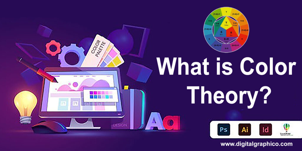
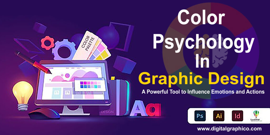
Color Psychology in Graphic Design: A Powerful Tool to Influence Emotions and Actions When it comes to graphic design, one of the most powerful elements that often gets overlooked is color. Not only does it serve an aesthetic function, but color can also influence emotions, behavior, and decisions. This is where color psychology in graphic design comes into play. Understanding how different colors evoke certain feelings or perceptions can help you design with purpose and intention, ultimately driving the desired results. In this blog, we’ll explore the significance of color psychology in graphic design, how it affects human behavior, and how you can use it to enhance your designs. Whether you’re a designer, a marketer, or simply someone interested in understanding design better, this guide will provide insights into how color can shape your message. What is Color Psychology in Graphic Design? Color psychology in graphic design is the study of how colors affect human emotions, thoughts, and behaviors. Colors have the ability to evoke powerful responses, making them a vital tool for designers looking to communicate specific messages or encourage particular actions. Graphic design is more than just creating visually appealing visuals. It’s about creating a connection with the audience. Color is one of the most direct ways to achieve this connection. For example, a red button on a website might encourage users to take action, such as purchasing a product or signing up for a newsletter, because of its association with urgency and excitement. The Impact of Color on Emotions Before diving into how you can use color in your designs, it’s important to understand how colors influence emotions and perceptions. Each color can evoke specific psychological responses based on cultural, social, and even personal factors. Let’s break down the meanings of some commonly used colors in graphic design: Red: Energy, Passion, Urgency Red is often associated with passion, love, and excitement, but it can also symbolize danger or urgency. It’s an intense, attention-grabbing color that can evoke strong emotions, both positive and negative. In graphic design, red is often used to encourage action or to create a sense of urgency. Think of the red “Buy Now” buttons on e-commerce sites or the bold red of fast-food logos—it’s a color that demands attention. Blue: Trust, Calm, Professionalism Blue is one of the most commonly used colors in graphic design, especially for corporate branding. It’s a color that exudes calm, trust, and professionalism. Many financial institutions and tech companies use blue to convey stability and security. If you want your brand to be perceived as reliable and trustworthy, blue is a great choice. It’s also known to lower heart rates and create a sense of serenity. Green: Nature, Health, Growth Green is often associated with nature, health, and prosperity. It’s a color that signifies growth, renewal, and balance. In graphic design, green is used to promote products or services related to health, wellness, or sustainability. If you’re designing for a brand that emphasizes eco-friendliness, green would be an ideal color choice. It also conveys a sense of harmony and is easy on the eyes, making it a popular choice for background colors. Yellow: Optimism, Happiness, Attention Yellow is a color of positivity, optimism, and energy. It can stimulate mental activity and inspire creativity. However, too much yellow can be overwhelming, so it’s often used as an accent color to attract attention. It’s ideal for designs that want to evoke feelings of joy and friendliness. Brands like McDonald’s and Ikea often incorporate yellow in their logos because it’s known to stimulate appetite and encourage action. Purple: Luxury, Creativity, Mystery Purple is a color that combines the calmness of blue and the energy of red. It’s often associated with luxury, royalty, and creativity. If you’re designing for a high-end brand or aiming for a sophisticated look, purple can help convey those feelings. Purple is also known to evoke a sense of mystery, making it a great choice for brands that want to appear innovative or avant-garde. Orange: Enthusiasm, Fun, Friendship Orange is a vibrant and playful color that represents enthusiasm and warmth. It’s often used to create a sense of fun and excitement, making it an excellent choice for brands targeting younger audiences. It’s also a color associated with creativity and innovation, so if your brand emphasizes these values, orange can be a great addition to your design palette. Black: Elegance, Authority, Sophistication Black is a color of sophistication, elegance, and authority. It’s often used in luxury branding, fashion, and high-end product packaging. Black conveys seriousness and exclusivity, making it perfect for designs that aim for a refined, timeless look. However, it can also be associated with darkness or negativity, so it’s important to balance it with lighter tones or pops of color to avoid an overly somber effect. White: Simplicity, Purity, Cleanliness White is a color that symbolizes simplicity, purity, and cleanliness. It’s often used in minimalist designs to create a sense of space and clarity. White backgrounds are common in modern web design because they help other elements stand out, creating a clean and organized layout. It’s also a great color for designs that want to communicate simplicity or a fresh start. Using Color Psychology in Graphic Design: Practical Tips Now that we’ve explored the emotional impact of different colors, let’s look at how you can apply color psychology in your own designs to maximize their effectiveness. Define Your Brand’s Personality Before choosing your color palette, it’s important to define your brand’s personality. Are you aiming to convey professionalism, creativity, or excitement? Understanding your brand’s core values will help you choose the right colors that align with the message you want to send. For example, a tech startup might opt for a clean, modern color scheme with shades of blue and gray, while a wellness brand may choose soothing greens and blues to evoke calm and healing. Consider the Target Audience Your audience plays a significant role in how they perceive colors. Age, gender, and cultural background can

What is Color Theory

What is Color Theory ?

Color Theory in Graphic Design: A Complete Guide for Designers When you think about design, what comes to mind? Is it the sleek layout of a website, the vibrant cover of a magazine, or maybe the packaging of your favorite product? Chances are, the colors in those designs played a significant role in catching your attention. This is where color theory in graphic design steps in—a foundational concept that transforms good design into a memorable masterpiece. In this blog, we’ll explore the importance of color theory, break down its core principles, and discuss how to use it effectively to make your designs shine. What is Color Theory?At its core, color theory in graphic design is the study of how colors interact, evoke emotions, and communicate messages. It provides designers with the tools to create harmony, contrast, and balance in their work. From websites and logos to posters and brochures, understanding color theory ensures that your designs don’t just look good they resonate with your audience. The Color Wheel: The Designer’s Palette The color wheel is the backbone of color theory. Developed by Sir Isaac Newton in 1666, the wheel organizes colors based on their relationships. Here’s a breakdown: 1.Primary Colors: Red, blue, and yellow. These colors cannot be created by mixing others.2.Secondary Colors: Green, orange, and purple, made by mixing primary colors.3.Tertiary Colors: Six colors formed by mixing primary and secondary hues, such as yellow-green or blue-violet. The color wheel helps designers visualize how colors relate and guides them in creating appealing combinations. Color Harmonies: Finding the Perfect Match Color harmonies are combinations of colors that look pleasing together. They’re a cheat sheet for creating balanced and eye-catching designs. Common harmonies include: Analogous: Colors that are next to each other on the color wheel, like blue, blue-green, and green. These create a soothing and cohesive look. Complementary: Opposite colors on the wheel, such as red and green. These combinations offer high contrast and energy. Triadic: Three evenly spaced colors on the wheel, such as red, yellow, and blue. This creates vibrant and dynamic designs. Monochromatic: Variations of a single color, creating a unified and elegant effect. Split Complementary: A base color paired with two adjacent to its complement, offering contrast while avoiding harshness. The Psychology of Colors Colors have the power to evoke emotions, set moods, and influence behavior. Here’s how some popular colors are often interpreted: Red: Passion, energy, urgency (commonly used in sales and food advertisements). Blue: Trust, calmness, professionalism (frequently seen in corporate designs). Yellow: Happiness, warmth, attention (perfect for playful or youthful brands). Green: Nature, health, growth (used by eco-friendly or wellness brands). Purple: Luxury, creativity, mystery (great for premium products). Black: Sophistication, power, elegance (often used in high-end branding). White: Simplicity, purity, cleanliness (ideal for minimalist designs). By understanding the psychology behind colors, you can align your designs with your target audience’s emotions and values. Practical Tips for Using Color Theory in Graphic Design 1.Understand Your Brand:Your color choices should reflect your brand’s personality and message. For instance, a tech company might use blues to convey trust and innovation, while a children’s brand might opt for bright yellows and greens to evoke playfulness.2.Stick to a Palette:A well-defined color palette ensures consistency across your designs. Use tools like Adobe Color or Canva’s color palette generator to experiment with harmonies.Pay Attention to Contrast:Contrast helps key elements stand out, whether it’s text on a background or a call-to-action button. Ensure that your designs are accessible by testing color contrasts for readability.3.Leverage Gradients and Textures:Flat colors are great, but gradients and textures can add depth and dimension to your work. Experiment with subtle transitions or layered patterns to make your designs more dynamic.4.Adapt for Cultural Context:Colors carry different meanings across cultures. For instance, white symbolizes purity in Western cultures but is associated with mourning in some Asian traditions. Research your audience to avoid misinterpretations. Tools to Simplify Color Choices Modern design tools make applying color theory in graphic design easier than ever. Here are some favorites: Adobe Color: Create and save palettes with real-time previews.Coolors: A fast and intuitive tool for generating palettes.Canva: Offers pre-designed palettes and color suggestions.Color Hunt: A curated collection of trending palettes. Real-World Applications of Color Theory in Graphic Design 1. Website Design: A website’s color scheme impacts user experience. For example, an e-commerce site might use vibrant colors to highlight sales, while a blog could opt for soothing tones to encourage reading. 2. Branding and Logos: Companies like McDonald’s use red and yellow to evoke hunger and energy. Meanwhile, tech giants like Facebook and LinkedIn stick to blue for reliability and trustworthiness. 3. Marketing Materials: Flyers, brochures, and social media graphics rely on eye-catching colors to grab attention and convey messages effectively. 4. Packaging Design: Packaging colors can influence purchasing decisions. For example, eco-friendly brands often use earthy tones like green and brown. Trends in Color Theory As design evolves, so do color trends. Some current trends include: Muted Tones: Softer colors for a minimalist and modern look.Neon Brights: For a bold and youthful vibe.Pastels: Versatile and soothing, perfect for lifestyle brands.Duotones: Pairing two contrasting colors for dramatic effects. Staying updated on trends ensures your designs remain fresh and relevant. Wrapping It Up Mastering color theory in graphic design isn’t just about making things look pretty—it’s about creating designs that communicate effectively and leave a lasting impact. Whether you’re a seasoned designer or just starting, understanding color theory is an essential step toward elevating your work. So, the next time you choose a color palette, think beyond aesthetics. Consider the emotions, context, and harmony that make your design truly unforgettable. Happy designing! What are your favorite ways to apply color theory? Let us know in the comments below! And if you found this guide helpful, don’t forget to share it with your fellow designers.

Popular 3 Software used for Graphics Designing

Popular 3 Software used for Graphics Designing Today Graphic designing has become the most important service for any business. Nowadays, every business needs something special in order to make them stand out among other businesses and it is graphic designing that provide a unique identity to every business or a website. These days, every business, company, or organization is having their own website and the most important element of a website is the graphics, visuals, and images. Graphics are not only used on the website, but they are also highly used in the printing materials like leaflets, banners, brochures, business cards and greetings. Popular tools and software used for Graphics Designing: Photoshop Photoshop is a most popular graphics editing software by Adobe that is used by professionals for editing and modifying any photo. It can be used with any operating systems and is available in multiple languages. Photoshop can be used to create images from scratch to modify simple photos into a professional one. In early days Photoshop was used to help image editing for the purpose of paper-based printing. But as technology advances, the functions are also been advanced. With the continued demand for image editing software’s, Adobe Photoshop has clearly emerged as an industries leading player. How Photoshop can turn simple photos into professional ones. Even if you are using SLR digital camera with red-eye reduction, it will still happen. Photoshop has red eye tool that will completely remove the red eye from the picture. The user will be able to create photos with more brighter and more vibrant colors. Photoshop is used to clean up a photo as well as beautify its overall look. Adobe Photoshop can be used to create Print Media, Web Media, Mobile Applications and in Image editing works. It is possible to remove blemishes and the imperfections in the photos; one can remove and change the backgrounds in the photos It can be used Photoshop to import the videos and the photos into the software quickly and easily. Removal of background elements unwanted from the image Cropping of elements out of the image CorelDraw CorelDraw is exceptionally exact and solid. It gives most appropriate controls in terms of designing; however, you should find a tough way to learn it. CorelDraw is most frequently and commonly used graphic designing application today. Previously CorelDraw was first drawing application that was fully window based application. Later some version of it was compatible with Apple Mac too. It is not compatible with Linux OS. It provides wonderful tools and commands which are most useful in illustration and layout making. It is also capable to make graphical artists task easier, simpler and faster to understand. The most popular logo design software is Corel Draw which is preferred by almost every logo designer because of its unique features. Some of the main advantages of Corel Draw are listed below: Fully customizable interface and tools that allows a user to change whatever he likes to. Corel is cheaper than other Logo design software packages. It does not take too much time to download files and does not consume much space on your computer. Corel Draw files can be converted to PDF. Where is CorelDraw mostly used? Stationery Designing Magazine Designing News Paper Designing Books Designing Illustration Making Logo Making Designing of Calendar Adobe Illustrator Today, Adobe Illustrator is one of the most widely used graphics designing tools by various designers all over the world. Unlike the Photoshop and Coral Draw, Adobe Illustrator creates the vector images that could be expanded to indefinite size without breaking the pixels. This ultimate feature of the Illustrator makes it quite handy for the designers to create and print the huge banners, and graphics without sacrificing the quality of the image. The other important thing to know about the Illustrator is that it stores the images and data in dots and grids instead of the bitmap. Illustrator uses the math’s based equations in order to draw the images based on the math equations and calculations. Advantages of using Adobe Illustrator It offers higher flexibility with customization. It has a very friendly user interface that allows users custom viewing of graphics. Unlike Photoshop and CorelDraw, Illustrator provides multiple options for text edits and its formatting. Illustrator increases the productivity by allowing a high level of multi-tasking for the designers. Since Illustrator use vectors, therefore, it allows the creation of graphics of indefinite sizes without losing their pixel strength and affecting its resolutions. Digitalgraphicco, a graphics designing company in Indore, India use the above software’s effectively and design the graphics as per the need of the client. These creative graphics help the clients to make their brand identity through Digital Marketing.

Best 10 Graphic Design institute in Pune

Top 10 Best Graphic Design Institutes in Pune Graphic design is more than just an art; it’s a powerful communication tool that shapes how we see and interact with the world. If you’re passionate about creativity and visual storytelling, graphic design can be a fulfilling career choice. Pune, often referred to as the “Oxford of the East,” offers a vibrant mix of education and creativity, making it an ideal place to kickstart your journey. In this blog, we’ll dive into the top 10 graphic design institutes in Pune, helping you find the perfect place to hone your skills and build a promising career. Why Choose Graphic Design as a Career? Graphic design blends creativity with technology, allowing professionals to create logos, branding, websites, and multimedia content that drives businesses forward. Here’s why you should consider a career in graphic design: High Demand: With businesses going digital, the need for skilled graphic designers is skyrocketing. Diverse Opportunities: From advertising to web design and motion graphics, the options are endless. Creative Freedom: Graphic design allows you to express your creativity while solving real-world problems. And if you’re in Pune, you’re already in one of India’s educational and cultural hotspots, which is home to some of the best graphic design institutes. What to Look for in a Graphic Design Institute? Before we jump into the list, let’s understand what makes an institute stand out: Comprehensive Curriculum: Ensure the course covers essential tools like Photoshop, Illustrator, InDesign, and advanced topics like UI/UX design, branding, and motion graphics. Experienced Faculty: A great institute will have mentors with real-world experience in the industry. Placement Assistance: Look for institutes that have a solid placement record and tie-ups with leading companies. Practical Exposure: Hands-on projects, internships, and workshops are a must for building your portfolio. Top 10 Best Graphic Design Institutes in Pune Here’s our curated list of the top graphic design institutes in Pune: MIT Institute of Design (MITID) MITID is one of the premier design schools in India, known for its rigorous programs and state-of-the-art facilities. Why Choose MITID? Comprehensive undergraduate and postgraduate courses in graphic design. Strong industry connections for internships and placements. Focus on innovation and real-world problem-solving. Courses Offered: B.Des in Graphic Design (4 years) M.Des in Graphic Design (2 years) Location: Loni Kalbhor, Pune Arena Animation Arena Animation is a household name in multimedia education, offering specialized courses in graphic design, animation, and VFX. Why Choose Arena Animation? Flexible course durations (short-term and long-term). Affordable fees with EMI options. Regular workshops and industry interactions. Courses Offered: Graphic Design Certification Advanced Programs in Graphic Design Location: Multiple branches across Pune Symbiosis Institute of Design (SID) Part of the renowned Symbiosis International University, SID offers an immersive learning experience for aspiring designers. Why Choose SID? Focus on both theoretical knowledge and practical application. Access to world-class design infrastructure. Opportunities to participate in global design events. Courses Offered: Bachelor of Design (B.Des) in Communication Design Location: Viman Nagar, Pune Seamedu School of Pro-Expressionism Seamedu specializes in creative media fields, including graphic design, animation, and game development. Why Choose Seamedu? Industry-relevant curriculum designed by professionals. Emphasis on hands-on projects and portfolio building. Placement support with connections to top media companies. Courses Offered: Bachelor’s and Diploma in Graphic Design Location: Kothrud, Pune Vishwakarma Creative-i College Known for its diverse range of creative courses, Vishwakarma Creative-i College is a go-to option for budding graphic designers. Why Choose Vishwakarma? Unique blend of traditional and modern design approaches. Workshops with industry leaders. On-campus placement drives. Courses Offered: Bachelor’s in Animation & Graphic Design Location: Kondhwa, Pune MAAC (Maya Academy of Advanced Cinematics) MAAC is another well-known name in design and multimedia education, offering a variety of courses in graphic design and animation. Why Choose MAAC? Advanced software training, including Adobe Suite and CorelDRAW. Focus on career-oriented skills. Regular seminars and guest lectures. Courses Offered: Advanced Diploma in Graphic Design Short-term Certification Programs Location: Deccan Gymkhana, Pune Creative-I College Creative-I College has carved a niche for itself in the world of design education, offering specialized graphic design programs. Why Choose Creative-I? Experienced faculty with industry expertise. Personalized attention due to small batch sizes. Affordable fee structure. Courses Offered: Certificate and Diploma in Graphic Design Location: Dhankawadi, Pune Inifd Pune Koregaon Park INIFD is known for its excellence in design education, and its Pune branch is no exception. Why Choose INIFD? A wide range of courses catering to beginners and professionals. Focus on UI/UX and web design. Strong alumni network in the design industry. Courses Offered: Graphic Design Certification Diploma in Visual Design Location: Koregaon Park, Pune Times and Trends Academy (TTA) TTA offers an array of professional courses, including graphic design, aimed at equipping students with practical skills. Why Choose TTA? Innovative teaching methods. Collaboration with industry experts for practical learning. Placement assistance in leading companies. Courses Offered: Diploma in Graphic Design Location: Deccan Gymkhana, Pune PAI International Learning Solutions PAI International is a relatively new but rapidly growing name in design education in Pune. Why Choose PAI? Hands-on approach to graphic design learning. Affordable and flexible course options. Regular project reviews and constructive feedback. Courses Offered: Certificate Courses in Graphic Design Location: Camp, Pune How to Choose the Right Graphic Design Institute? Assess Your Goals: Decide whether you’re looking for a short-term certification or a full-fledged degree. Visit Campuses: Take a tour of the institutes to understand their facilities and infrastructure. Check Alumni Success Stories: A successful alumni base is a great indicator of the institute’s quality. Compare Fees and Placements: Balance affordability with opportunities for internships and jobs. Conclusion Pune offers some of the best opportunities to study graphic design, thanks to its thriving education sector and creative culture. Each of these graphic design institutes in Pune brings something unique to the table, catering to diverse needs and aspirations. Whether you’re just starting out or looking to sharpen your skills, the right institute can make all the difference in your career. Explore your options, and take the first

Scroll to Top